Products You May Like
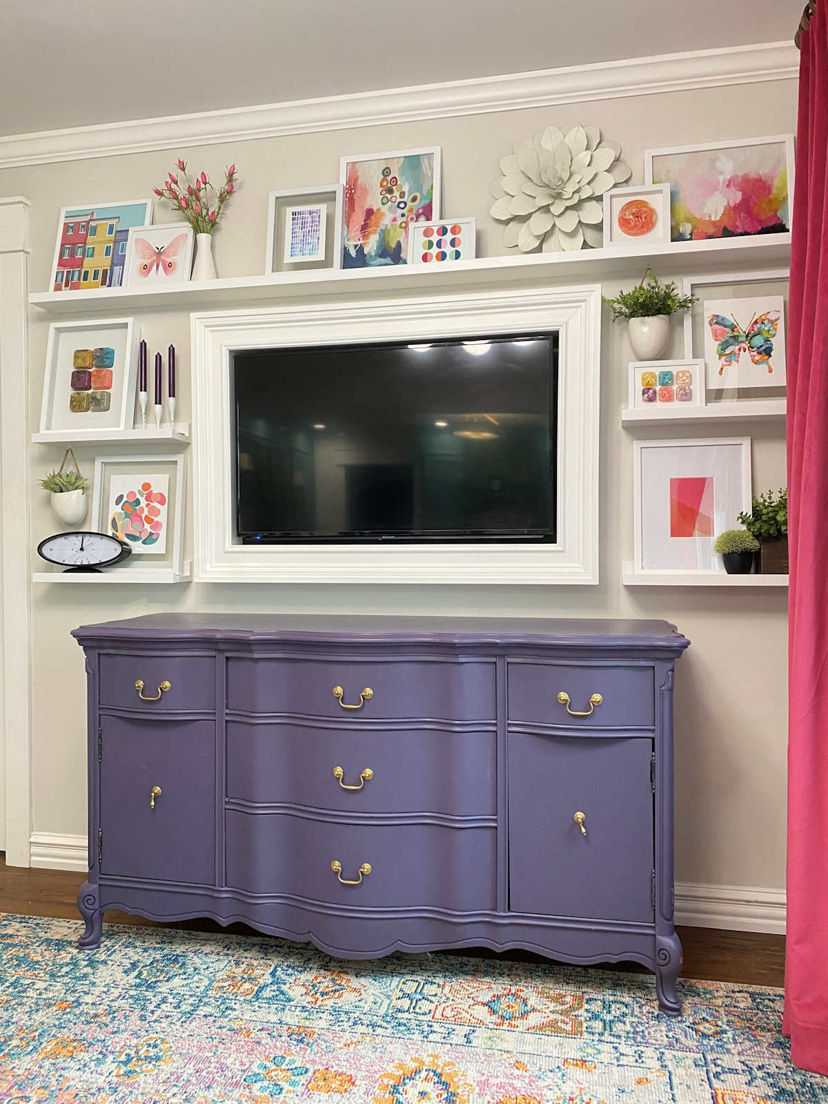
I am still thoroughly enjoying my new picture ledges in the sitting room that I built and filled with all kinds of colorful and fun artwork. If you missed that project, you can find those details here. I’ll admit that I walk through that room a couple of times a day just specifically to look at the shelves and the artwork on them. 😀
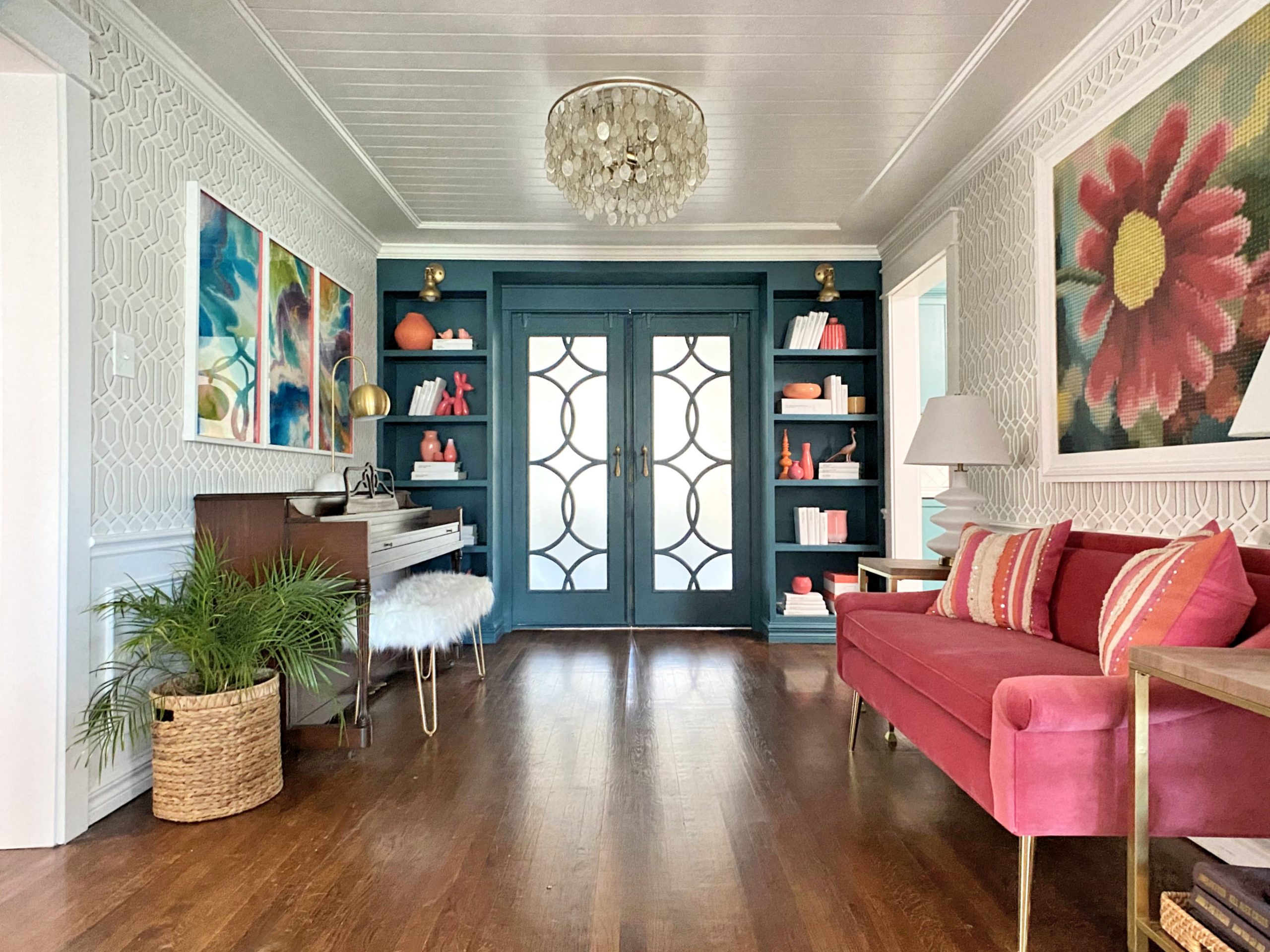
And if I’m being completely honest, the new still hasn’t worn off of the music room bookcases, either. It brings a smile to my face to walk through that room and see those shelves filled with such colorful items.
I love decorating shelves, but it can be a challenge sometimes to get things looking balanced and eye-pleasing, especially for someone like me who would rather everything just be perfectly symmetrical. Perfect symmetry doesn’t really work on bookcases, shelves, and picture ledges, so sometimes it takes me a bit longer to find arrangements that are asymmetrical while still looking balanced.
I’ve learned a few tips over the years that have helped me, so I wanted to pass those along to you in case you struggle with this sometimes as well. Note that none of these are hard and fast rules. But if you have a bookcase or shelves that don’t quite look right, you can try to incorporate a few of these tips and see how that works out for you.
1. Groupings in odd numbers are pleasing to the eye.
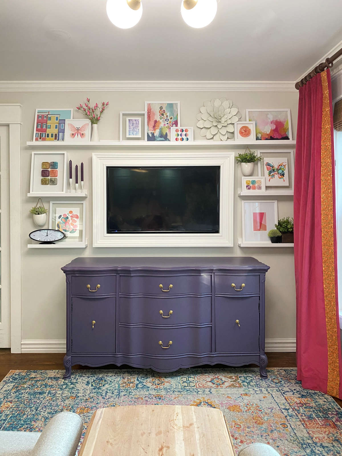
We’ve all heard this, right? And I can tell you that it’s true! In fact, odd numbers (and for some reason, three in particular) when decorating something like bookcases and shelves are so naturally pleasing to the eye that I do it without even realizing it. When I was placing things on our new picture ledges, I was just bebopping along and arranging things, moving things around, adding things, removing things, until everything looked balanced to my eye.
And what did I end up with? Groupings of threes on every single ledge, with three groupings of three on the top long ledge. I didn’t plan that, and it wasn’t intentional. It’s just what looked balanced and pleasing to me.

On the music room bookcases, more times than not, I wound up with odd numbers as well. I have a few shelves with one large colorful item, other shelves with groups of three, and only a couple of shelves with two colorful items.
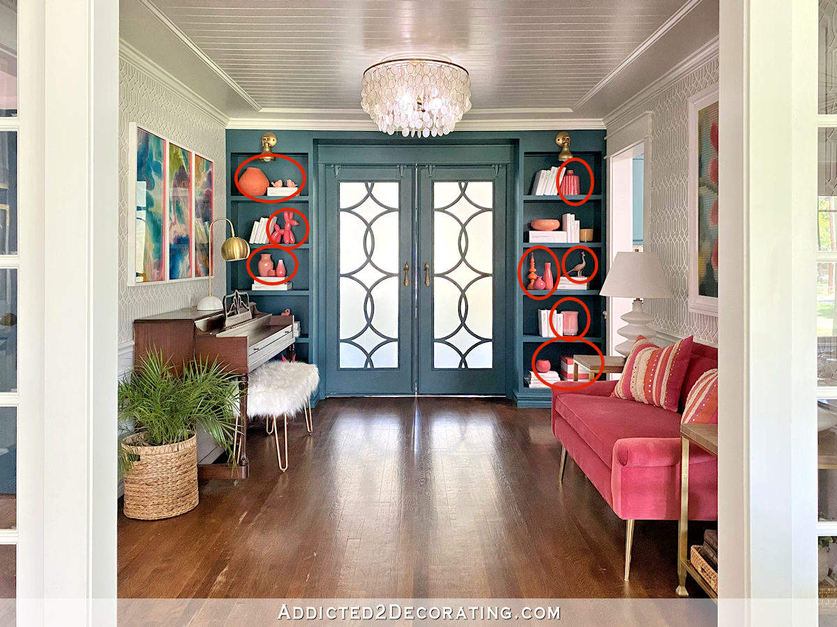
But like I said, it’s not a hard and fast rule. Just use that as a guideline if something doesn’t look quite right. But if you have a pair of items that looks right to you (like my one shelf above with only two colorful items on it), then obviously there’s no reason to change it.
2. Leave some breathing room.
When I started out arranging the picture ledges in the sitting room, my very first attempt at the top shelf had stuff all the way across from one end to the other, with no breaks at all. It gave that shelf a very cluttered look, which you can see here. (Please excuse my light that keeps falling from the ceiling.)
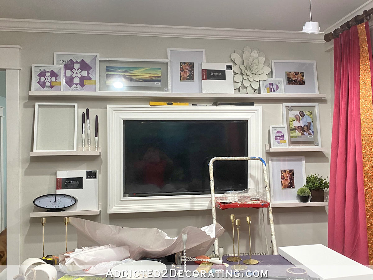
I got a little frustrated with it, took a picture to see if I could pinpoint what was wrong with it, and took a break for a while. When I came back, it seemed very obvious what the problem was. I needed to give the items some space. So I layered a grouping, made a space, layered another grouping, made a space, and layered one last grouping. That looked so much better and much less cluttered.
On the music room shelves, I also tried to leave some breathing room on most of the shelves. There’s no need to pack a shelf full from one side to the other. I mean, you can certainly do that on a few, but there’s no need for every single shelf to be packed full. These bookcases have plenty of breathing room.

3. Vary the height of the items.
As a general rule, varying the height of the items on the shelves is going to produce a much more interesting collection than if you fill your shelves with items that are all the same height. This is kind of common sense, and yet it’s something I find challenging almost every single time I start decorating shelves. In fact, you can see that it was a bit more of a challenge for me on the music room bookcases, but I did seem to manage a bit better (and in my opinion, end up with a better result) on the sitting room picture ledges.
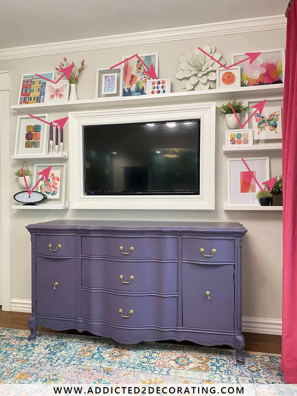
I find that it looks so much better if you don’t have items of the same height lined up right next to each other. Of course, there are always exceptions to this. So again, this is not a hard and fast rule. It’s just something to keep in mind if you’re struggling to get your shelves to look right. See if you have items of the same height lined up next to each other, and if so, try spacing them apart with items of varying height in between and see how that works.
4. Not everything has to sit on the shelves.
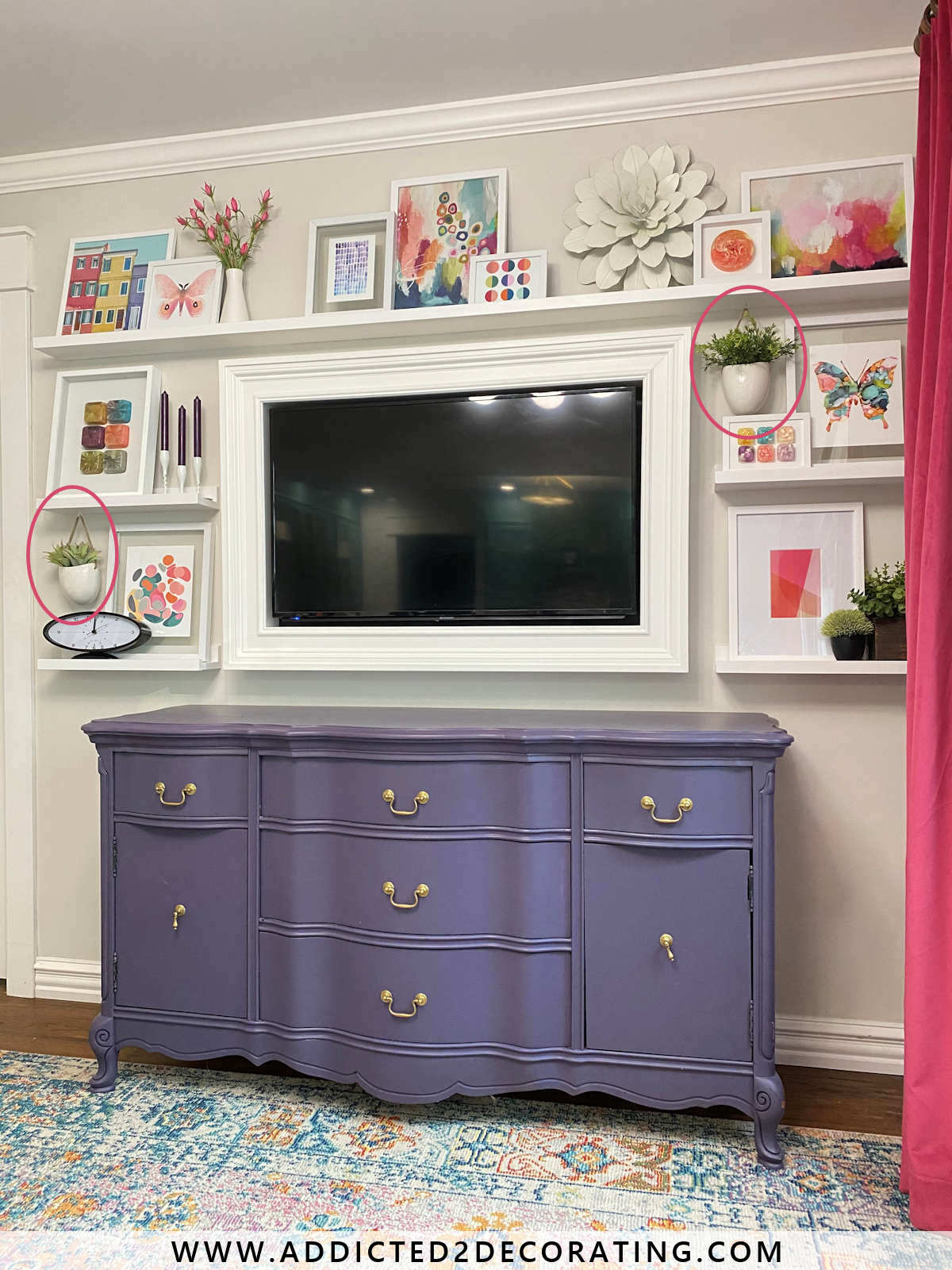
Keep in mind that just because you’re decorating shelves, that doesn’t mean that every single item you use has to actually sit on the shelves. For example, on the picture ledges, I used two hanging planters in the arrangements on two of the shelves.
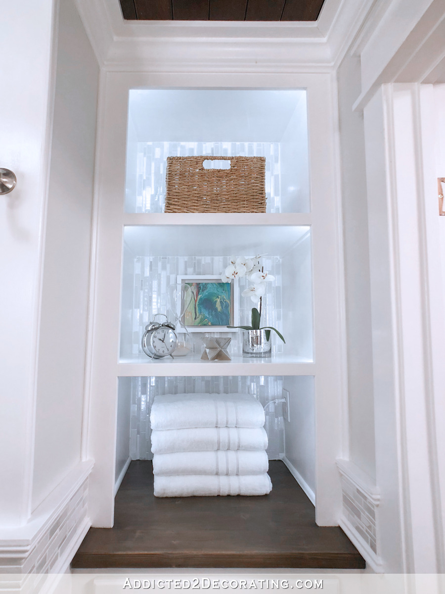
And on the shelves in the hallway bathroom, I hung a piece of artwork above one of the shelves instead of setting it on the shelf. This gave more varying heights to the shelf than I could have created by placing the artwork on the shelf or even on an easel.
5. Use books on bookcases.
This is a personal pet peeve of mine, and it’s completely a personal thing. But since these are my tips, I’m adding it. 😀
If you’re decorating bookcases, add books. Even if you’re not a big reader, go to the used bookstore and pick up some books for your bookcases. They add interest. You can use them to add height to your items you want to show off. And the word is literally in the name. They’re bookcases. 😀 And if you’re just wanting to use them to decorate, vary the placement from shelf to shelf, and make sure that they’re not perfectly lined up from one shelf to the next.
You can see on the music room bookcases that I have some upright, some lying flat, some leaning out, some leaning in. And from shelf to shelf, the placement is varied.
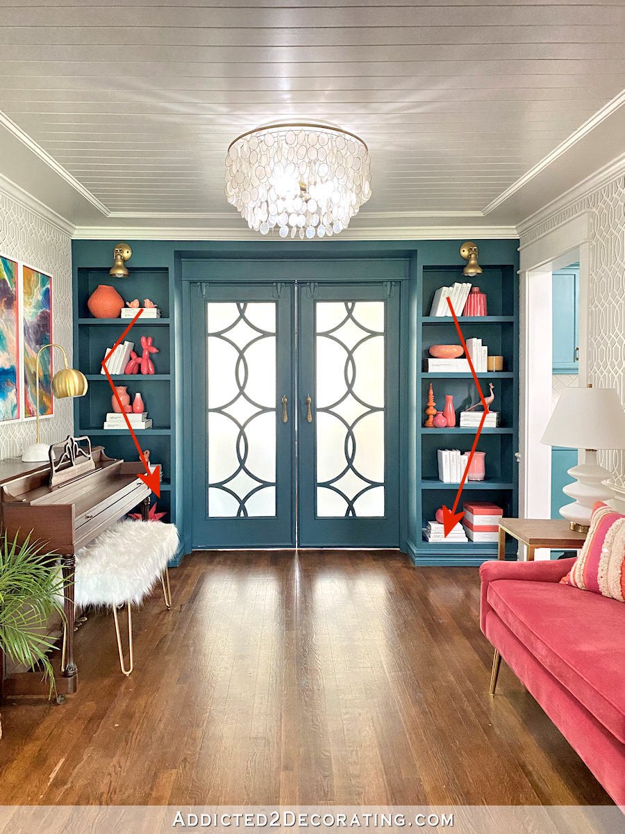
I’ve walked into so many homes over the years (and I see this very often in open houses and model homes) where the bookcases are filled with nothing but tchotchkes from side to side, top to bottom. To my eye, when bookcases and shelves are nothing but tchotchkes, things blend together and it becomes harder to appreciate any of the decorative items. Books provide a resting place for the eye and spread out the decorative items so that they can be seen easier and appreciated more.
Once again, there are exceptions to these tips. I’ve seen some bookcases and shelves that were dedicated exclusively to the display of a beautiful collection, like white ironware dishes from side to side and top to bottom, or nothing but colorful glassware. Shelves and bookcases dedicated to collections obviously don’t need books. 🙂
And finally…
6. If you’re a bibliophile…
Completely ignore everything I said about decorating bookcases. 😀 I know for you bibliophiles out there — those of you who have collections of hundreds of books that you’ve actually read and treasure — people like me who are all about the decorative and the pretty, who cover our books in white paper because we think that the colors of the spines are distracting, and who go to used bookstores to purchase books that we’ll never read to serve decorative purposes only, are a real source of frustration. I get it. So if that describes you, forget the decorative stuff. Forget the “breathing room”. Forget the “varying the heights and arrangements of books from shelf to shelf” thought. You do you, and you stuff those shelves from side to side, top to bottom, with the books you love and treasure. Because I know that you get just as much enjoyment out of seeing your bookcases stuffed with those treasures as I do seeing my picture ledges filled with colorful artwork. 🙂
Addicted 2 Decorating is where I share my DIY and decorating journey as I remodel and decorate the 1948 fixer upper that my husband, Matt, and I bought in 2013. Matt has M.S. and is unable to do physical work, so I do the majority of the work on the house by myself. You can learn more about me here.
I hope you’ll join me on my DIY and decorating journey! If you want to follow my projects and progress, you can subscribe below and have each new post delivered to your email inbox. That way you’ll never miss a thing!
